Friday, 10 December 2010
Evaluation- Analysing my finished product- Double Page Spread

It obvious that this double page spread is very unique and when compared to current magazines holds an individuality due to it's manipulation of photos, collecting them in a collage. A collage is used to encode the youth and relaxed attitude of the music, as there is no order to the photo's and also collages are created as a memory for the youth to look back on in the future.
Each photo comes from a different collection of images, grunge rock, glam rock and festival rock. Everyone of these images code an important factor of the indie rock, girl culture and reflects a chosen celebrity for inspiration. This reflection allows the reader to make a connection and establishes the bands identity within the culture. The costume in each photo encodes the relax approach of the music, and some of the glamourous side of it in the 'Glam Rock' photos.
A convention of magazines are interviews, like this one on this double page spread, using different colour fonts to establish between the interview and the bands responses. Also the colloquial language used within the interview codes the bands relaxed, youthful identity. This language is also easier for the target audience to read and enjoy.
Again the same font is used consistently on this double page spread, as used on the contents pages and front page. This establishes and reflects the bands identity, for example the font used for other rock bands such as Nirvana and Fall out boy.
Evaluation- Analysing my finished product- Contents Page

Through the process of anaylising current contents pages of music magazines it is clear that they some use and cram the page with pictures and text, whereas others use them more effectively providing key information to allure the audience to read certain pages; this is what I have tried to achieve.
Like the front cover the contents page uses the same colour scheme of pink, black and white. Using the same colour scheme through a music magazine is a convention of the magazine and company as it establishes their identity. However the pink within this issue of the magazine encodes the issue theme of 'Girl Power'. The colours black and white are also a convention of rock music as it codes the anarchy reported to come along side with the heavy rock music, however it also codes some sort of sophistication compared to the bright primary colours used on pop magazines.
Also the theme of the use of paint tool (paint splatter) codes the rebellion and art work associated with rock music, i.e. graffiti.
On this contents page only one picture is used of the cover band, showing that they are the main topic of this issue. This use of one picture or minimal images is a convention of magazines which I have chosen to exploit. By using the same font for the band that was on the front cover shows the consistency and establishes the bands identity.
Compared to the content pages I have analysed, I have chosen to have minimal pages shown in the contents. This is so the audience is allured to read about these specific topics highlighted and associated with the issues theme. By using bold fonts for each title of the pages codes the importance of the pages and the topics.
Editors columns are apparent in all magazines, either reflecting a light hearted topic to do with the issue or something that has occurred in the week or the process of production. In this editors column it has been constructed to be related to the theme of 'Girl Power' dwelling in past bands and artists that the target audience have knowledge of creating humour and a relaxed feel of the magazine.
Evaluation- Analysing my finished product- Front Cover

Snare! magazine clearly codes the indie rock music genre through the media language; body language, costume, facial expressions, colour schemes, and font styles. The facial expressions of each band member are moody and quite sincere. This codes the rebellion of the indie rock culture and youth, also this kind of facial expression is also apparent on other indie music magazines such as NME the issue with Lily Allen on the cover. This sincere facial expression is also a clear contrast to any cheesy smiles found on the covers of pop magazines such as the Top of the Pops cover I have analysed, reflecting the attitude and mood of the music genre.
The body language also codes the attitude of the indie genre as each member looks very relaxed and unposed compared to the artificial smiley, posed covers of pop and the controversial, provocative poses found on R'n'B covers. This codes for the relaxed approach the artists of indie music has to their music, as their lyrics are based on 'real life' everyday situations.
To relate to the target audience of girls aged between 17-25, it was important to highlight a key aspect of girl's culture within this 'Girl Power' issue, fashion. The costume chosen for the front cover is very recent and a current image in fashion of the indie culture. The lace tights and shorts are also quite provocative highlighting that the band also use a small idea of 'sex' to sell themselves in this chart. The costume of the band is predominately black which is very dark and usually codes the gothic genre/culture, this one aspect that indie rock has adopted.
The colour scheme of the front cover links to the theme of the issue 'Girl Power' as pink is associated and is universally used to code girls and their femininity. However combining the colour pink with black now encodes the idea of 'Rock Chick' which is what is being achieved through the whole colour scheme within the magazine.
On the cover there are many different font styles used, each style is very bold. This bold font used for the conventional title of a magazine, achieves the audiences attention. Also as each font used on the cover codes the rebellion of the indie rock culture as none of them are aligned or straight, and reflect handwriting.
As a magazine made for media coursework compared to other current products uses and exploits the conventions of magazines effectively, as straplines, titles, puffs and the photo manipulation are all present on this cover of Snare!.
Wednesday, 8 December 2010
Production-Double Page Spread
The final product of the double page spread featured in my music magazine Snare! is as above. To achieve this product I went through many stages of production on the programme photoshop, which I will show below.

As I decided to create a collage for my double page spread I had to use the polygonal lasso tool to cut around each image used, removing all the backgrounds.

Then after to add a misty pink transparency over the collage I used the shape tool and added a layer. I used the colour pink to add feminity (the theme of this issue) then changed the transparency so all of the images could be seen still. After this I added two other rectangles for the background for the text, also adding some transparency effect.

For the next step I added the title of the pages 'The Lovless- exclusive interview', to add consistency I used the same font for the bands name that is on the front cover and contents page. I also used the apint tool to add the paint splatter effect, adding colour and youth to the font.

Then I added the interview using the text box tools, keeping to the layout of interviews in other magazines having two collumns of text in the one box. To define between the interviewer and the band I chose to use two different fonts, black for the interviwer and pink for the bands response.

For the final touches I have added pull quotes within the interview, an arrow to show that the interview will carry on the other pages, page numbers and a heart which is associated with the band 'The Loveless'.
Production- Contents Page
Above is the final product of the contents page of my magazine Snare!, like the production of the front cover I will show every step of production through screen shots.

The first step of producing the contents page is to put in the rectangular shapes for the editiors collumn and page catergory titles. Also like for the front page I chose a photo of the band and used the polygonal lasso tool, to cut around the bodies and getting rid of any background of the image.

After I added the titles by using the font tool for the page catergories, magazine name and 'this week'. I chose to use the same font for the magazine name, page catergories titles and the 'this week', this codes the theme of the magazine which will be used through the magazine. However I chose a different font for 'Girl Power' as it is the title of the issue, and it looks as if someone has wrote it.

After I added the text of the page numbers, titles and brief summary of the contents to the page. I made sure that the allignment was all the same and that the all the fonts are readable. Also I added the font layered across the image of 'The Loveless' stating what page it is on, which is apparent in most magazines.

The final detail of the contents page was to add the editors collumn which are always found in a magazine whether it is in on the contents page or further in the magazine. Within the editors collumn I chose to use colloquial language and a light hearted feel making it easy for the readers to read.
Production- Front Cover
Above is my final version of the front cover of my own music magazine Snare!, however I will show how I have accomplished this product by using the programme Photoshop and exploiting it's tools to their full potential. The way I will show the production is through print screen shots of the programme and the stage that it was at.

The first step of making the front cover was to make a descision of what colour the background is going to be of the front cover, like many other indie rock magazines I chose the colour white, and then create upon this blank canvas. After I chose the photo I wanted of the band, then use the polygonal lasso tool to cut around the bodies of each member.


I then chose the to layer the pictures, for one member to be in the foreground and the other in background, this choice adds dimensions to the front cover and composes a better front page. After this I added the magazine title 'Snare!' in the chossen font, transformed it to fit in the corner on the diagonal layered over the bands images. I found a good paint tool effect and how I have used it has given the effect of rebellion as it looks like paint splatter acorss the front page, which codes for the youth and it's artistic culture.

The next step was to add the barcode, puff (pink circle) and strapline to the cover. To achieve this I simply used the shape tool, then added the effects of emboss to make it look more professional.

Then I added the contents of the strapline and puff, by using the text tool. I chose to use quite simple language which will communicate to the audience easier.

The last step of production of the front cover was to add the last details of text, cover lines, date, issue number and website. These final details reflect current magazine covers, as they are a convention of the magazine production.
Production- Font Styles
To give my magazine and band their own identity I have researched and produced a range of font styles for both.
Snare (magazine name)

This font style is very young and creative, which is part of the magazines identity. Also some of the effects on the letters reflect sound like the sound-waves.

I like this font as it is bold and the effects used on the letters are very creative. However bubble writing is usually associated with pop magazines, therefore I shall not use this font.

This font clearly conveys the Indie rock genre, however I do not like the difference of boldness of each letter.

This is the font i have decided to use as it's simplicity conveys the genre of the magazine but it is also bold and will stand out on the cover of the magazine.
Band Name - 'The Loveless'

For the bands name I have decided to use a handwriting effect as it gives character to the band and their name. However this specific font style is too italic and is not youthful enough for the bands identity.

This font is more youthful but is does not convey the genre of Indie Rock very well.

This is the font that I have decided to use for the bands name as it identifies the band and music genre.
Snare (magazine name)

This font style is very young and creative, which is part of the magazines identity. Also some of the effects on the letters reflect sound like the sound-waves.
I like this font as it is bold and the effects used on the letters are very creative. However bubble writing is usually associated with pop magazines, therefore I shall not use this font.
This font clearly conveys the Indie rock genre, however I do not like the difference of boldness of each letter.

This is the font i have decided to use as it's simplicity conveys the genre of the magazine but it is also bold and will stand out on the cover of the magazine.
Band Name - 'The Loveless'

For the bands name I have decided to use a handwriting effect as it gives character to the band and their name. However this specific font style is too italic and is not youthful enough for the bands identity.

This font is more youthful but is does not convey the genre of Indie Rock very well.
This is the font that I have decided to use for the bands name as it identifies the band and music genre.
Wednesday, 1 December 2010
Production- Images from photoshoot
For the production of my music magazine I have taken a wide range of photo's in all of the different styles discussed. Here are a selection of the photo's I have taken:
Grunge Rock

These images all consist of costume and make-up that code the grunge rock aspect of Indie Rock. In each photo the body language is very relaxed, coding the aspect of teenagers to be very relaxed and to take everything easy. This whole relax feel is shown withn the facial expressions and attitude of each photo.
Glam Rock

To give these photo's a glamourous feel the models are either pouty or with a slight smile. The bold print on each of the dresses, is very eye-catching to the glamour. Also the varied use of camera shots highlight either the whole costume, or show the band in a more stunning feel.
Festival Rock

Grunge Rock

Glam Rock

To give these photo's a glamourous feel the models are either pouty or with a slight smile. The bold print on each of the dresses, is very eye-catching to the glamour. Also the varied use of camera shots highlight either the whole costume, or show the band in a more stunning feel.
Festival Rock

To achieve the fun aspect of festivals and their culture, each image has a sense of quirkiness. This is reflected through the body language, smiling facial expressions and composure within the shot.
Monday, 29 November 2010
Planning/Production- Camera Shots
Mid- Shots


Is a camera shot from a medium distance.
Allows to see the mise-en-scene and background.
Contains a figure from the knees/waist up. This will allow me to show the outfits of the band which fit in to the indie rock image.

Close-ups
- Shows very little background, and concentrates on the face.
- The face takes up most of the frame.
- More detail is seen on the persons face, e.g make-up

Wednesday, 24 November 2010
Planning/Production- 'The Loveless' Interview
Interviews are constant in every issue of a music magazine (but not always nescissarily the main contents of) with artists about topics such as:
Interview
- The artists/bands new album
- Gigs
- The artists/bands new single
- Fashion
- General Gossip
- The artists/bands rise to fame
Interview
Whoever said that girl power was dead had obviously not heard of ‘The Loveless’ (cover band) The new girl band on the scene have re-vitalised those two iconic words by adding a bit of rock and roll. Taking time out from their sell out tour Carrie and Alex sit and chat to SNARE!
Hi girls, how’s it going?
Alex: This is the first time I have had a chance to sit down in two weeks; it has just all been mental…a good mental, of course.
Carrie: Life is so surreal. I feel like someone is going pinch me and wake me up from this dream.
Did you ever dream about being this famous?
C: Actually, I never dreamed about being famous, just dreamed about making our own music. I’m just so happy to be doing this with my best friend.
A: Awww, she is so sweet! Everyone wonders what it is like to be famous but now that we are I just can’t get my head around it. I knew it would be crazy (being this famous), but to think that a year ago I was an ordinary student in sixth form about to do my A-levels. But now every time we go out we are stopped by fans screaming names, wanting pictures and singing our songs.
C: It’s so mad; I can’t even go the local news agents without being recognised.
Have you ever thought about investing in some kind of disguise?
A: [Laughs] Now you’ve suggested it, we must!
C: Yeah Alex would really suit a long ginger beard and glasses, start a new fashion trend.
A: Oh how lovely!
Every band that we have interviewed have been inspired by other bands and artists. Who is your inspiration?
C: We have many inspirations mainly from 80’s, 90’s rock.
A: We are pretty old school. [Laughs]
C: We love Blondie, Guns ‘n’ Roses, Bon Jovi, Queen and Led Zeppelin. We are both huge fans of all their music. And we like to believe that we are doing them justice by bringing back true rock ‘n’ roll.
A: Also our parents always told us to live our dream, and here we are, living it! So we are both truly thankful for what our parents do for us and what they have had to put up with; guitar lessons, rehearsals, auditions, photo-shoots, gigs etc. You name it they have always been there for us.
So where are they today then?
C: Having a much needed weekend away which we have treated them to.
A: We thought that we would give something back to them.
Whoever thought such humble girls could create the largest mosh pit in the electric ball last night!
C: That was so amazing!
A: Not amazing, it was immense. The crowd were so alive, and everyone was moshing, crowd surfing. That’s true rock and roll.
C: We both come of stage and were really gutted ‘cos we wanted to join in. But someone had to provide the music.
Would you of crowd surfed?
C: Definitely.
A: I’m afraid of heights, so no. [Laughs]
C: It’s not that high!
A: But still…
Carrie, are you afraid of anything?
C: I have a massive fear of clowns. When I was younger I could never go to the circus or birthday parties (with clowns) because of them.
You have a very individual approach to fashion, style and image. Did anyone inspire you? Or is it just a statement saying ‘this is who we are’?
Both: Erm.
C: We have always been interested in fashion, always keeping up with the latest fashion trends, hairstyles and all that, like every teenager does. A: We dress like how we feel. So I think that we have just created our style and image through our personalities. But it’s quite nice think that we are ‘fashion icons’ now.
[Both Laugh]
Your new single ‘Second time over’ is out this week, how are you feeling about it?
A: Releasing a new single is always fun, all the lead and up press can be stressful, but to us it’s all about the response to our music. We are only interested in our fans and if they like our new music and what we are doing.
C: ‘Second time over’ is basically about not giving up on anything. We can really relate to it as we got so many knock a back before we got to where we are now and it is hard but you should never give up. Just try, try and try again.
If you weren’t part of the current music industry, what would you be doing?
C: We are very lucky to be where we are now, but if we weren’t I would of completed my A-levels and go to University to study music production. Then try my hardest to get Alex and I a career from there.
A: If I wasn’t part of ‘The Loveless’ I think that I would of gone to University to study performing arts. I always dreamed to be on a West-End stage, not very rock ’n’ roll, I know. But it singing, dancing and acting is something I have done from the age of three. That’s where Carrie and I met.
C: And it all happened from there. Alex has always been in my life.
A: Lucky you!
What a lovely note to finish on. Thank you girls for your time and coming for an interview and photo-shoot at SNARE! We hope you have enjoyed it.
Both: Thanks.
Buy ‘The Loveless’ new single ‘Second time over’ on I-tunes.
Win tickets to ‘The Loveless’ tour- enter online.
Friday, 19 November 2010
Planning- Images for the photoshoot
Grunge Rock
This style was influence by celebrities such as Taylor Momsem:

 Within my photoshoot this style while consist of the following costume and make-up:
Glam Rock
This style is inspired by Fearne Cotton:

 To achieve this style within the photoshot the costume and make-up:
Festival Rock
This style was inspired by Pixie Lott:

 To achieve this festival image within the photoshoot, the costume and make-up are:
This style was influence by celebrities such as Taylor Momsem:

- Net/lace tights
- Denim Shorts
- Baggy t-shirt or vest
- Biker boots
- Long socks
- Dark eye make-up
- Messy hair
Glam Rock
This style is inspired by Fearne Cotton:


- Prom/fancy dresses
- High Heels and converse
- Knee High socks
- Red Lipstick
- Quiffs
Festival Rock
This style was inspired by Pixie Lott:


- Denim Shirts/Jacket
- Floral
- Leggings
- Boots
Planning- Drafts of Double Page-Spread
I have created three drafts of my initial ideas for the double pages-spread of my magazine; some which challange the conventions of a typical magazine.
My double-page spread will include a wide range of images of the band 'The Loveless' and an interview with them. However I want to create something very individual but still employs the conventions of a double-page spread:
 As I have decided to take many photo's of the band in different styles of indie fashion, to show them in a collage is decidingly the best way to show the majority of the photos. Also by creating a collage it reflects youth as making some sort of scrap book or collage is popular in teenage years, and it also a fun way to show all photo's reflecting my skills in using photoshop. In this draft the collage will be surrounding the interview and will go across both of the pages. Pull quotes highlight specific parts of the interview, usually the comic or gossiping extracts of the interview. These allow the reader to read the contents of the interview, without reading it as a whole. Also puff's have been used to promote the band's new single and that the interview is an exclusive to the magazine.
Draft 2

This draft however does not exploit as many images as the other, this will allow me to choose for images that will clearly show the bands image and style. Also the image on the right links back to draft one of the front covers which is made quite regulary through the use of the same images, fonts etc. On the draft the whole interview is not on the pages as many interviews in magazines take over more than a double page spread, by including this will show by understanding of the different lengths of magazine interviews.
Draft 3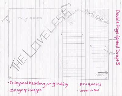
My double-page spread will include a wide range of images of the band 'The Loveless' and an interview with them. However I want to create something very individual but still employs the conventions of a double-page spread:
- Title
- Interview- spoken parts to be clearly distinguished through either font styles or colour.
- Images
- Pull Quotes
- Page numbers

Draft 2

This draft however does not exploit as many images as the other, this will allow me to choose for images that will clearly show the bands image and style. Also the image on the right links back to draft one of the front covers which is made quite regulary through the use of the same images, fonts etc. On the draft the whole interview is not on the pages as many interviews in magazines take over more than a double page spread, by including this will show by understanding of the different lengths of magazine interviews.
Draft 3

Draft three combines both draft one and two in some of the ideas; the collage, not to have the whole interview on the page. The right hand side of the double page spread will resemble some old collage by changing the colour qualities of the images, then above it have a quirky font of 'The Loveless' splattered acorss it which will code rebellion and youth.
Planning-Drafts for contents page
I have created three drafts of my initial ideas for the contents of my magazine; some which challange the conventions of a typical magazine.
In any type of magazine the contents page is always the first page of the magazine, and is equally important as the front cover, as it has to intregue the audience to read the magazine by displaying the issues contents in an appealing way. The conventions it has to include is:

Draft one includes all of the conventions listed, and is very busy with page titles and small summaries. Even though it uses all the conventions it is quite basic, but is practical in highlighting the pages of importance (the image of the cover band, and the page number clearly stated). Like other music magazine contents pages the titles and summaries of pages are catergorised, this makes it easier for the reader to find what they enjoy reading about e.g. gigs. As this certain issue of the magazine is themed as 'girls take over' this will be shown through the titles and included in the editors collumn, which will be original and individual to the magazine.
Draft 2
 Draft two has some qualities of draft one; catergorising the pages, image of the cover band, editors collumn, title linked to the theme. However this idea is very minimalistic compared to the busy page of draft one. The title will also adopt a bold font and use of feminim colours such as pink, to highlight the issues theme. This is also shown by the use of symbols (hearts and x's).
Draft 3

In any type of magazine the contents page is always the first page of the magazine, and is equally important as the front cover, as it has to intregue the audience to read the magazine by displaying the issues contents in an appealing way. The conventions it has to include is:
- titles of each page
- page numbers
- a brief summary of each page titled
- images
- editors collumn (in only some magazines on the contents page)
- images

Draft 2

Draft 3

This final draft is very different to both as I was inspired by Q's contents page by reflecting the music genre through symbols, doodles and fonts. The idea for this contents page was to allow it to resemble a girls notebook and to have the fonts to reflects handwriting and doodles. This idea will establish the target audience and is a very original approach to a contents page.
Thursday, 18 November 2010
Planning-Drafts of Front Cover
I have created three drafts of my initial ideas for the front cover of my magazine; some which challange the conventions of a typical magazine.
Draft 1

This magazine cover is original as it challanges many music magazine conventions, for example the matshead is on a diagonal on the right hand corner which is not shown in analysing current products. Also the images are an extreme close up of half of the bands faces, this highlights and draws the attention of the audience on their facial expressions and make-up which sells themeselves as a band. The close-up also highlights the feminitiy of the band as it reveals their make-up in close detail. The amount of cover lines used within this front cover is very minimalistic, which allows and uses the image of the band to sell the magazine as used on the 'Rolling Stone' covers. The strapline simply highlights the issues theme of 'girl power' by having female artists and bands names, which is a convention used on magazine covers. However this magazine cover also has some flauses such as the masthead being on the right hand corner will be covered when stacked on shelves, also having minimal lines on the cover might not attract as many people as they may not have an interest in the band.
Draft 2
 Compared to draft one this cover is much more busy with pictures, cover lines and how the strapline is used. Like many other music magazines, for example 'Kerrang!' the mast head is central and bold. The image of the band does not take up the whole page which allows more pictures of other artists in the issue which may attract more people than the target audience to read the issue, this is also another convention used on 'Kerrang!' covers. On this cover to sell the cover band's interview I have used the idea of pull qoutes from the interview to intise the readers. The strapline like on draft one has the names of other female bands and artists however this one is on the diagonal adding colour and attention the 'girl power' issue.
Draft 3

Draft 1

This magazine cover is original as it challanges many music magazine conventions, for example the matshead is on a diagonal on the right hand corner which is not shown in analysing current products. Also the images are an extreme close up of half of the bands faces, this highlights and draws the attention of the audience on their facial expressions and make-up which sells themeselves as a band. The close-up also highlights the feminitiy of the band as it reveals their make-up in close detail. The amount of cover lines used within this front cover is very minimalistic, which allows and uses the image of the band to sell the magazine as used on the 'Rolling Stone' covers. The strapline simply highlights the issues theme of 'girl power' by having female artists and bands names, which is a convention used on magazine covers. However this magazine cover also has some flauses such as the masthead being on the right hand corner will be covered when stacked on shelves, also having minimal lines on the cover might not attract as many people as they may not have an interest in the band.
Draft 2

Draft 3

Draft three is a combination of both other drafts, as the only image on the page is the main band of the issue (draft 1), the strapline is on a diagonal (draft 2), pull quotes (draft 2), minimal cover lines (draft 1) by combinding these have created this original cover. From draft one I have considered the idea of having the masthead on one of the corners, however it is now on the left after thinking about the way magazines are stacked on shelves in shops. The image and style of the band is also being used the sell the magazine as much contents is not shown, but a close up/ mid-shot of the band is used higlighting their clothes, make-up and attitude to sell the magazine.
Planning- Magazine and band names
Both my magazine and cover band will need an original name, which reflects youth and slight rebellion to attract the target audience. To create ideas of names I shall have to see what the names of current Indie Rock magazines and bands are.
Current Magazine Names
Current Magazine Names
- NME- is an acronym for 'National Musical Express' which has become well known by the target audience throught the weekly release of magazines, radio and internet updates.
- Kerrang!- the name is onomatopoeic for the noise made by playing a power chord on and electric guitar.
- Q- Originally it was to be called Cue (as in the sense of cueing a record, ready to play), but the name was changed so that it wouldn't be mistaken for a snooker magazine.
- Kaiser Chiefs- They were named after the South African football club Kaizer Chiefs.
- Bat for Lashes- Stage name for Natasha Khan.
- The Arctic Monkeys
- Gossip- Formerly known as 'The Gossip'
- BASS
- SNARE!-is the name of a type of drum, which is used in Indie Rock music.
- FM (free music)- uses the idea of an acronym like 'NME'
- IR music (indie rock music)
- Unheard
- Rah!
- Sweet Symphony
- Dismissed.
- Bitter Lies
- Rah!Rah!
- The Loveless- is an edgey girl band name as many girl bands sing about love and etc.
- Unspoken Truth
- Alice in our land- takes the idea of the fairytale story.
Planning- Specification
- My magazine will have the aspects of and include the 'Indie Rock' genre.
- The target audience of my magazine will be females aged 17-21 students, and fans of 'Indie Rock' music.
- My magazine will be a specific issue of 'Girl Power' within the Indie Rock genre; including well established female indie artists and the cover band will be a new girl indie rock band. This theme will be apparent through the cover, contents page and double-page spread.
- The cover band will have a name which codes rebellion of girl indie roack bands.
- On the double-page spread there will be a wide range of photos reflecting different images and styles of the band.e.g. grunge rock and glam rock.
- The double-page spread will be accessible to the target, therefore it will have a chatty and fun tone whilst also promoting the cover band, in the form of an interview.
Wednesday, 17 November 2010
Research- Media Institutes
To be able to create a good piece of coursework and product (front cover, contents page and double page spread) I will need to achieve an understanding of current media instituations in this magazine market. To achieve this I am going to research into three current Indie music magazines, Kerrang!, NME and Q.
Kerrang!


Kerrang!
Kerrang! is a well established rock/metal music magazine however it has expanded it's horizons to a radio station, tv channel and a company to promote tours and hold their own gigs and tours. Kerrang! commenced publication on 7 June 1981 and was edited by Geoff Barton, initially as a one-time supplement in the Sounds newspaper, which focuses on the genre New Wave of British Heavy Metal and the rise of other hard rock acts. AC/DC appeared on Kerrang!’s first cover. To understand more about Kerrang! and it's current position in the market I conducted research by reading and exploring their website:
By going on this website I followed the links to their news, TV and radio.
NME

NME is also another well established music magazine, but it focuses on the Indie rock genre and culture of music. NME also have their own official website, a website to sell tickets for gigs and tours, chart website (where readers and fans votes are counted), radio and awards. The New Musical Express (better known as the NME) is a popular music magazine in the United Kingdom, published weekly since March 1952. It was the first British paper to include a singles chart, in the 14 November 1952 edition. In the 1970s it became the best-selling British music magazine. During the period 1972 to 1976 it was particularly associated with gonzo journalism, then became closely associated with punk rock through the writing of Tony Parsons and Julie Burchill.
NME's official website: http://www.nme.com/
Q
Q magazine is the last that I have researched. A like the others Q has a radio station, website, magazine, current issue page, news and a chart. Q is a music magazine published monthly in the United Kingdom, with a circulation of 130,179 as of June 2007. Q was first published in October 1986, setting itself apart from much of the other music press with monthly production and higher standards of photography and printing. In the early years, the magazine was sub-titled "The modern guide to music and more". Originally it was to be called Cue (as in the sense of cueing a record, ready to play), but the name was changed so that it wouldn't be mistaken for a snooker magazine. Another reason, cited in Q's 200th edition, is that a single-letter title would be more prominent on newsstands.
Q official website: http://www.qthemusic.com/
Conclusion
After researching into these institutions these are the things that I will need to consider:
- The power of the internet: websites and music downloading
- The audiences knowledge of the internet
- How media institutions use more than one source to sell themselves within the market
- How these magazines have developed into many other sources of the media over the years of production
- If I were to develop this coursework further I would need to consider more of the use of internet and other media sources
Subscribe to:
Comments (Atom)